5 Color Combinations for Tiny House Harmony
Choosing the right color palette for your tiny barndominium can truly transform your cozy living space, creating an ambiance that feels warm, inviting, or even surprisingly expansive.
Let s explore five captivating color combinations from the cozy embrace of reds and browns to the serene calm of blues and grays. This exploration will guide you in selecting colors that enhance your home s personality, making it feel larger and more open. You ll also find tips on mixing shades and steering clear of common pitfalls.
Whether you re redecorating or starting from scratch, these insights will empower you to craft a harmonious atmosphere in your tiny barndominium.
Contents
- What You Should Remember:
- 1. Warm and Cozy: Red, Orange, and Brown
- 2. Earthy and Natural: Green, Brown, and Beige
- 3. Serene and Relaxing: Blue, White, and Gray
- 4. Bright and Bold: Yellow, Pink, and Purple
- 5. Minimalistic and Modern: Black, White, and Gray
- How to Choose the Right Color Combination for Your Tiny House?
- Frequently Asked Questions
- What are the top 5 color combinations for tiny house harmony?
- How do neutral tones with pops of color create harmony in a tiny house?
- Why are shades of blue and white popular for tiny houses?
- How can earthy tones with subtle pops of green create harmony?
- What is the benefit of a monochromatic color scheme with different textures?
- How do pastel colors with metallic accents bring harmony?
What You Should Remember:

- Warm, earthy tones create a cozy atmosphere in small spaces.
- Using natural colors like green and brown can bring a sense of connection to the outdoors in a tiny barndominium.
- Cool tones like blue and gray can create a tranquil and calming environment.
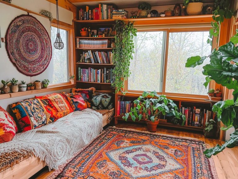
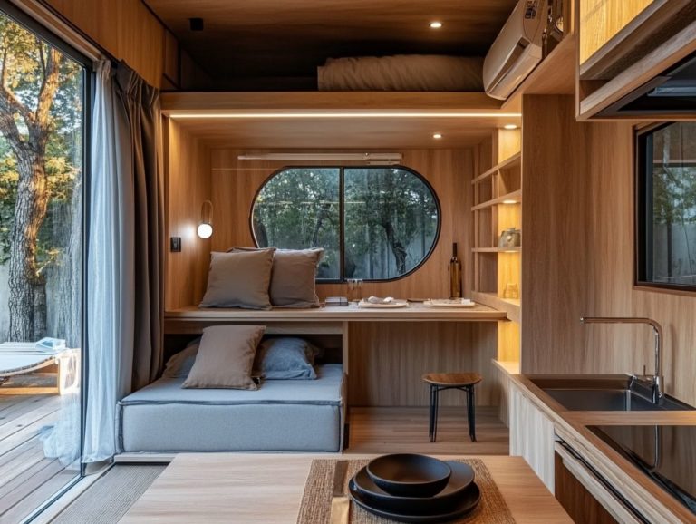
1. Warm and Cozy: Red, Orange, and Brown
When you re aiming to create a warm and cozy atmosphere in your tiny barndominium, consider embracing the bold hues of red, orange, and brown. These colors exude rustic charm while beautifully complementing modern comforts, transforming your cozy living space into a welcome retreat.
By incorporating earthy tones into your interior design, you enhance the aesthetic of your barn condominium and create a harmonious relationship with the rustic architecture typical of these tiny house plans.
You can integrate these shades seamlessly by painting accent walls in deep red or burnt orange, evoking feelings of warmth and togetherness. Brown works wonders too; think of it as a foundation in your wooden furniture or flooring, adding rich texture and depth.
To elevate that inviting ambiance, don t underestimate the power of soft lighting. Warm-toned LED lights can soften those bold colors, casting a gentle glow that envelops the space. This thoughtful combination fosters a sense of tranquility, making your small haven feel expansive and lived-in ideal for creating cherished memories with homeowners and loved ones.
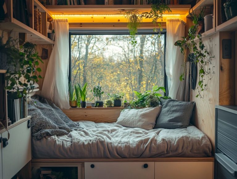
2. Earthy and Natural: Green, Brown, and Beige
Incorporating an earthy and natural color palette of green, brown, and beige into your tiny barndominium creates a harmonious balance with the surrounding rural lifestyle. This allows you to embrace the tranquility of nature right within your living space, showcasing the beauty of rustic vibes.
To enhance this connection, consider blending these colors through thoughtful design techniques such as accent walls, textured fabrics, and nature-inspired decor. Integrating customization options like reclaimed wood furniture or vintage accents not only adds character but also promotes sustainability.
Current trends favor neutral tones as a backdrop, allowing these earthy hues to truly shine. By layering soft earth tones and incorporating greenery through houseplants, your interiors will reflect the serene landscapes outside, transforming your space into a welcoming oasis that resonates with the peaceful essence of nature.
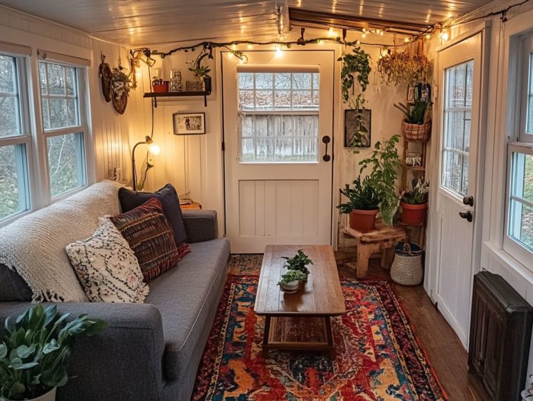
3. Serene and Relaxing: Blue, White, and Gray
The serene blend of blue, white, and gray in tiny house plans can evoke tranquility and relaxation, making it an ideal choice for you if you’re seeking modern comfort in your living spaces, reflecting contemporary color trends.
These soothing hues can be seamlessly woven into various elements of your interior design, from wall colors to furnishings, ensuring a consistent look. For instance, soft blue walls paired with white trim can create a bright, airy feel, while gray accents ground the space, adding depth without overwhelming it.
To enhance this calming atmosphere further, consider incorporating layered lighting like warm-toned LED fixtures or delicate pendant lights to soften shadows and boost the overall serenity. According to color theory, blue is known to lower heart rates and promote calmness, making it an excellent choice for your bedrooms or reading nooks.
Meanwhile, white reflects light and creates the illusion of expansive spaces, while gray adds sophistication without distraction.
Ready to choose your color palette? Transform your tiny barndominium into a cozy retreat that reflects your personal style!
4. Bright and Bold: Yellow, Pink, and Purple

Bright and bold colors like yellow, pink, and purple can infuse a dynamic flair into your charming barndominium. They offer a creative and flexible approach to interior design that showcases your unique personality and preferences.
These vibrant hues can easily blend into your home decor through accent walls, colorful furniture, or decorative textiles like throw pillows and rugs. To strike the perfect balance between liveliness and serenity, pair these striking colors with soft neutrals like beige or light gray.
For example, imagine a sunny yellow accent wall with a gray sofa adorned with pink and purple cushions. This creates a harmonious space that feels both vibrant and inviting.
Add colorful artwork or fun light fixtures to show off your unique style while maintaining a cohesive look that feels intentional and thoughtfully curated.
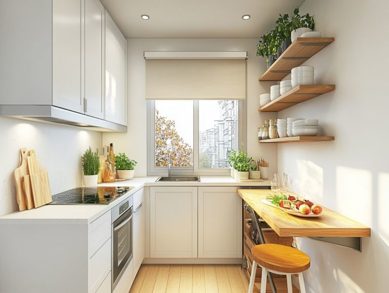
5. Minimalistic and Modern: Black, White, and Gray
The minimalistic and modern aesthetic achieved with a color palette of black, white, and gray makes your space feel bigger while amplifying the visual experience of tiny house plans.
By embracing simplicity, your interior design prioritizes functional elements without compromising on style. This enables you to use space wisely while seamlessly supporting your daily life. Balancing your design with key principles like proportion and harmony creates serene and inviting spaces.
Colors are integrated thoughtfully to evoke tranquility, ensuring that every piece serves a purpose. This reflects a keen understanding of how minimalist choices can transform even the coziest areas into stylish, modern homes.
How to Choose the Right Color Combination for Your Tiny House?
Choosing the perfect color combination for your tiny house is your chance to make your space truly your own! It involves exploring your personal style, the design elements at play, and effective design techniques to create a thoughtful color palette that enhances both aesthetics and functionality.
Crafting a harmonious ambiance is essential; it reflects your unique personality and lifestyle in every shade. Think about how each color can stir different emotions. Soft blues and greens bring tranquility, while bold reds and yellows add bursts of energy. Understanding the role of color psychology in tiny house design can help you make more informed choices in your decor.
Don t shy away from customization options like accent walls or eclectic decor to amplify your space’s character. Understanding color theory is invaluable; the right combinations create visual cohesion, drawing attention to highlights and ensuring every corner feels warm and inviting.
Ultimately, a strategic approach to color selection can transform your tiny space into a personal sanctuary that truly feels like home. By learning how to use color to create space in tiny homes, you can offer a visual adventure that suits every homeowner.
What Are the Factors to Consider When Choosing Colors?
When selecting colors for your tiny house, consider various factors, including your personal taste, design principles, and current color trends that resonate with your vision for the space, especially given the rise of tiny barndominiums.
One essential factor is the impact of lighting on color perception. Both natural and artificial light can dramatically alter how colors appear throughout the day, influencing the overall atmosphere of your home. Choosing the right shades enhances visual appeal and evokes specific emotions, whether you’re aiming for a warm, inviting ambiance or a cool, calming retreat.
By understanding how different colors interact with light, you can craft a cohesive design that harmonizes with your decor and lifestyle, ultimately creating a space that feels uniquely connected and truly personalized.
How Can Colors Affect the Perception of Space in a Tiny House?

Colors wield remarkable influence in shaping your perception of space in tiny house plans. Lighter shades can create the illusion of openness, while darker hues evoke a sense of intimacy and coziness.
In residential designs, a soft pastel palette can cultivate a tranquil atmosphere, making compact areas feel airy and inviting. Bold jewel tones infuse energy and passion, transforming a modest room into a vibrant focal point. For those interested in maximizing their small spaces, exploring the power of color in tiny house spaces can be particularly beneficial. Designers often use contrasting colors to define distinct zones within an open layout, enhancing your visual journey.
For instance, picture a kitchen adorned with bright yellow accents against neutral tones it stimulates the appetite and becomes a central gathering hub.
The strategic use of color influences mood and guides your experience through various spaces, ensuring both comfort and aesthetic appeal. It makes your home decor feel intentional and curated.
Master the Art of Color Mixing for Your Tiny House!
Mixing and matching colors in your home decor requires an understanding of color basics and practical design techniques that foster harmony and balance among your chosen shades, allowing for creative flexibility.
One effective strategy is the 60-30-10 rule. Allocate 60% of a room’s color to a dominant hue, 30% to a secondary shade, and 10% to an accent color that delivers a striking visual impact. This approach brings your space to life with warmth and style!
Interior designers are instrumental in this process, guiding you through various color combinations while considering factors like lighting and existing elements. Collaborating with a designer helps achieve a flawless blend that mirrors your unique style and enhances the overall ambiance of your home.
How Can Color Psychology Be Applied in Tiny House Design?
Color psychology shapes the mood and ambiance of your tiny house, allowing you to choose hues that reflect your desired home personality and nurture your emotional well-being.
Understanding how different colors evoke feelings helps you craft spaces that enhance your daily life. For example, soft blues and greens envelop you in calm and tranquility, making them ideal for bedrooms or meditation areas. In contrast, warm tones like yellows and oranges invigorate your surroundings, sparking creativity and enthusiasm perfect for small kitchens or workspaces.
Incorporating principles of balance and contrast can amplify these effects. Harmonious color combinations promote relaxation, while sharper contrasts can energize and motivate. Your thoughtful selection of colors becomes a powerful tool in shaping not just aesthetics but your overall well-being.
Avoid These Common Mistakes When Choosing Color Combinations
As you select color combinations for your tiny house, it s easy to stumble into pitfalls like overlooking how colors interact or neglecting the impact of lighting on your chosen palette.
Understanding that colors dramatically influence both the perception of space and the mood within your cozy square footage is crucial. Overusing bold colors might overwhelm your senses, making a compact area feel cramped rather than inviting. To enhance your tiny home, consider 5 ways to personalize your tiny house design. Mismatched tones can create a disjointed look, detracting from the overall harmony of your design.
To sidestep these missteps, embrace a cohesive color scheme featuring softer shades complemented by thoughtfully placed accent colors. Staying informed about trends that promote balance and serenity will enhance your living space and help it truly feel like home.
Have you chosen your favorite colors for your tiny house yet? Explore color schemes that work in tiny house interiors to inspire your choices, or reach out for help in designing your dream space!
Frequently Asked Questions

What are the top 5 color combinations for tiny house harmony?
Here are the top 5 color combinations for a harmonious tiny house: neutral tones with bright accents, blue and white shades, earthy tones with green accents, a simple one-color scheme with varied textures, and pastel colors paired with metallic touches.
How do neutral tones with pops of color create harmony in a tiny house?
Neutral tones like white, beige, and grey create a calm backdrop. Bright accents add personality, achieving a delightful balance between simplicity and vibrancy.
Why are shades of blue and white popular for tiny houses?
Blue and white evoke tranquility, perfect for a peaceful tiny home. This combo also makes the space feel clean and airy, enhancing its size perception.
How can earthy tones with subtle pops of green create harmony?
Earthy tones, including browns and greens, give a natural feel. Adding touches of green from plants or decor enhances this vibe and fosters relaxation.
What is the benefit of a monochromatic color scheme with different textures?
A monochromatic scheme brings a streamlined look. Mixing textures, like smooth and rough surfaces, adds visual interest and balance.
How do pastel colors with metallic accents bring harmony?
Pastel shades create warmth and coziness. Metallic accents, like gold or copper, introduce glam, fostering an inviting atmosphere.